
The Psychology of Colour in Print: How Colour Choices Impact Consumer Perception
Since time immemorial, an essential part of effective marketing has been capturing attention. And once they grab that attention, brands do everything they can to engage the emotions of their particular target audience.
Regardless of the times or trends, colour is one of the most powerful ways to influence consumer perception. Though they may noy have understood the full implications of how colour affects mood or psychological responses, marketers have long recognized that different hues evoke different emotions and responses in people. This is still true today.
Since the earliest days of print to the digital world of today, colour is king. And by making an effort to understand the psychology behind your brand colour choices, you can harness their potential to create a lasting impact on your audience.
In this article, we’ll explore how the impact colour has on consumer perception to help you make informed decisions when designing your print materials.
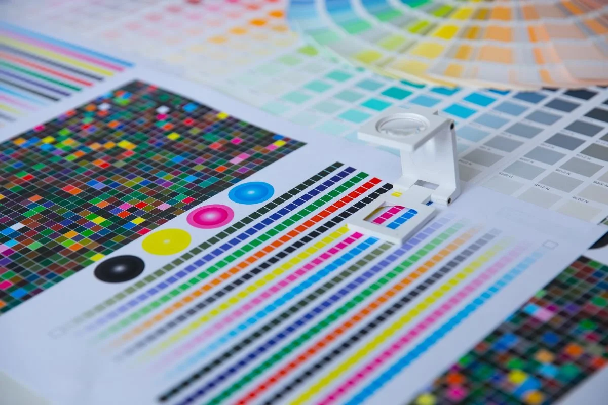
Understanding Colour Psychology
Colours have the remarkable ability to evoke specific emotions and associations, making them a vital aspect of visual communication. Each colour possesses unique qualities that can influence how individuals perceive and respond to your print materials, no matter the medium or type of project goal.
By tapping into the psychology of colour, you can strategically influence consumer behaviour and drive desired outcomes.
Red: The Power of Passion and Energy
Where do we often see red? In food and restaurant branding. Why? Because when it comes to capturing attention and creating a sense of urgency, red is the colour of choice. It exudes energy, excitement, and passion, making it ideal for highlighting specific messages (like, “You’re hungry” or “Our brand offers the best bacon and hotdogs") or calls to action.
Whether it's a vibrant headline, a striking call to action, or a powerful accent, red can help you grab your audience's attention and create a sense of urgency in their minds.
Blue: Trust, Stability, and Reliability
As red is synonymous with food and restaurant branding, there’s a reason we see so many blue corporate logos… Blue is associated with trustworthiness, dependability, and professionalism. Incorporating blue into your branding and print materials conveys a subliminal sense of credibility and reliability.
Whether it's a blue logo, background, or accent, this colour choice instills trust in your audience and enhances the perception of your brand or organization.
Green: Growth, Nature, and Health
Green is often associated with growth, nature, and health. This is why we so often see green in branding for gardening or landscaping businesses, supermarket chains, and even educational companies or institutions.
Green also symbolizes freshness, vitality, and sustainability. Incorporating green into your print materials can help convey a commitment to environmental consciousness or promote health-related products or services. Whether it's a leafy motif, a vibrant background, or eco-friendly imagery, green is a powerful colour in today’s environmentally- and educationally-conscious world.
Yellow: Optimism and Warmth
Yellow is the colour of optimism, happiness, and warmth. It can instantly create a cheerful and inviting impression in your print materials. Paired with colours like red or blue, it adds an element of excitement to other underlying emotions.
Whether you choose to use yellow as a background, highlight specific elements, or infuse it into your imagery, this colour can evoke a sense of positivity and create an engaging experience for your audience.
Using Colour Combinations and Contrast
In addition to individual colours, colour combinations and contrast play crucial roles in print materials. Complementary colour combinations can create visual harmony and enhance the overall impact.
Likewise, contrast, such as using light and dark shades, can draw attention to specific elements and guide the viewer's gaze. Consider experimenting with different colour palettes and contrast levels to achieve the desired visual balance in your print materials.
The Psychology of Colour in Print
Harnessing the psychology of colour in your print materials is a powerful way to captivate your audience, evoke emotions, and shape their perception of your brand or organization. Whether you're aiming to grab attention, convey trustworthiness, promote environmental consciousness, foster positivity, or create a sophisticated look, the right colour choices can make a significant impact on how your audience perceives and engages with your print materials.
By understanding the unique qualities of each colour and the associations they evoke, you can strategically design your print materials to influence consumer behaviour and drive desired outcomes.